App redesign

App redesign

App redesign

App redesign

Project type:

Project type:

Bootcamp Project

Bootcamp Project

Role

Role

UI/UX Designer

UI/UX Designer

Duration

Duration

4 Weeks

4 Weeks

Project Overview and Challenge

I undertook the redesign of the mobile app for Davanni's Pizza & Hot Hoagies, a Minnesota-based family restaurant chain. The existing hybrid app had poor ratings and numerous usability complaints from users on various app stores.

My objective was to create native iOS and Android apps that would improve the online ordering experience. This involved:

  • Transforming a problematic hybrid app into intuitive native experiences

  • Adhering to both iOS and Android design guidelines

  • Maintaining brand consistency

  • Delivering a solution within the constraints of an academic project

Research and Analysis

I focused on three key areas of research:

  1. Design Analysis: I closely examined well reviewed food ordering apps to understand their design decisions and information architecture. This helped inform what elements and information I would need to include in my redesign.

  2. Platform Guidelines: I examined the design patterns for both iOS and Android to understand the platform-specifics and best practices.

  3. User Feedback: I analyzed existing Davanni's app reviews to identify primary pain points and areas for improvement.

This research provided a good starting point to understanding user needs, industry standards, and platform requirements, forming a solid foundation for my redesign strategy.

Key Design Decisions

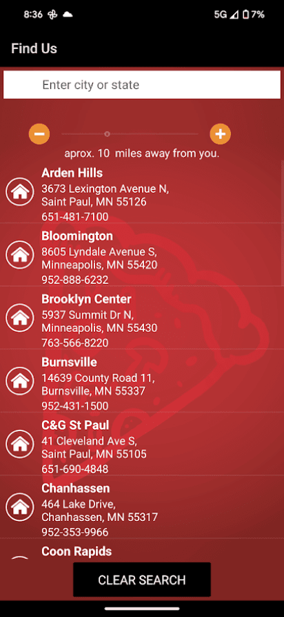
Store Locator Redesign

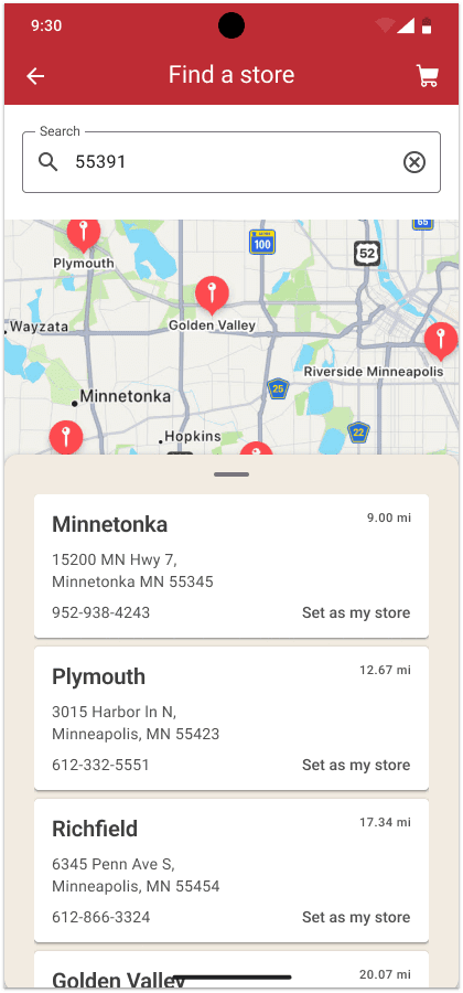
Users found selecting store locations to order from not intuitive. To address this, I implemented an interactive map with clearly designed location cards. This caters to both visual-oriented users who prefer map-based selection and those who favor a list view.

Users found selecting store locations to order from not intuitive. To address this, I implemented an interactive map with clearly designed location cards. This caters to both visual-oriented users who prefer map-based selection and those who favor a list view.

Users found selecting store locations to order from not intuitive. To address this, I implemented an interactive map with clearly designed location cards. This caters to both visual-oriented users who prefer map-based selection and those who favor a list view.

Users found selecting store locations to order from not intuitive. To address this, I implemented an interactive map with clearly designed location cards. This caters to both visual-oriented users who prefer map-based selection and those who favor a list view.

Old design

New design

Order Method Page Enhancement

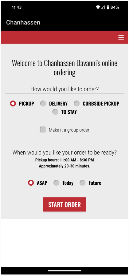
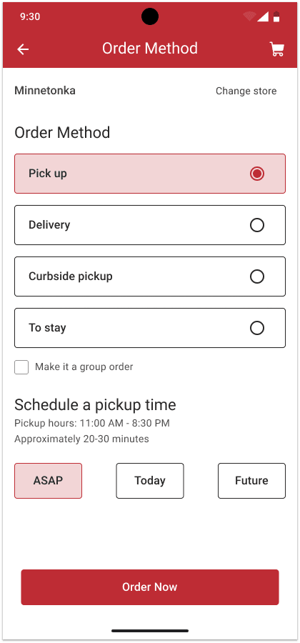
The original page lacked clarity and ease of use. My solution involved increasing the size of interactive elements and improving page hierarchy. Larger, more prominent buttons should improve accessibility and reduce user error, creating a more intuitive ordering process.

Old design
New design
Menu Navigation Improvement

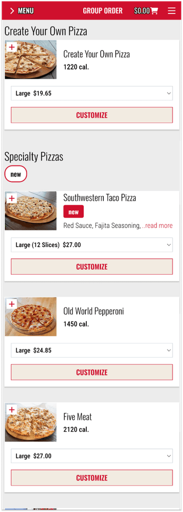
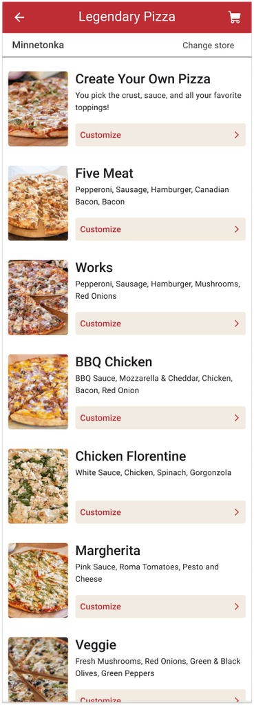
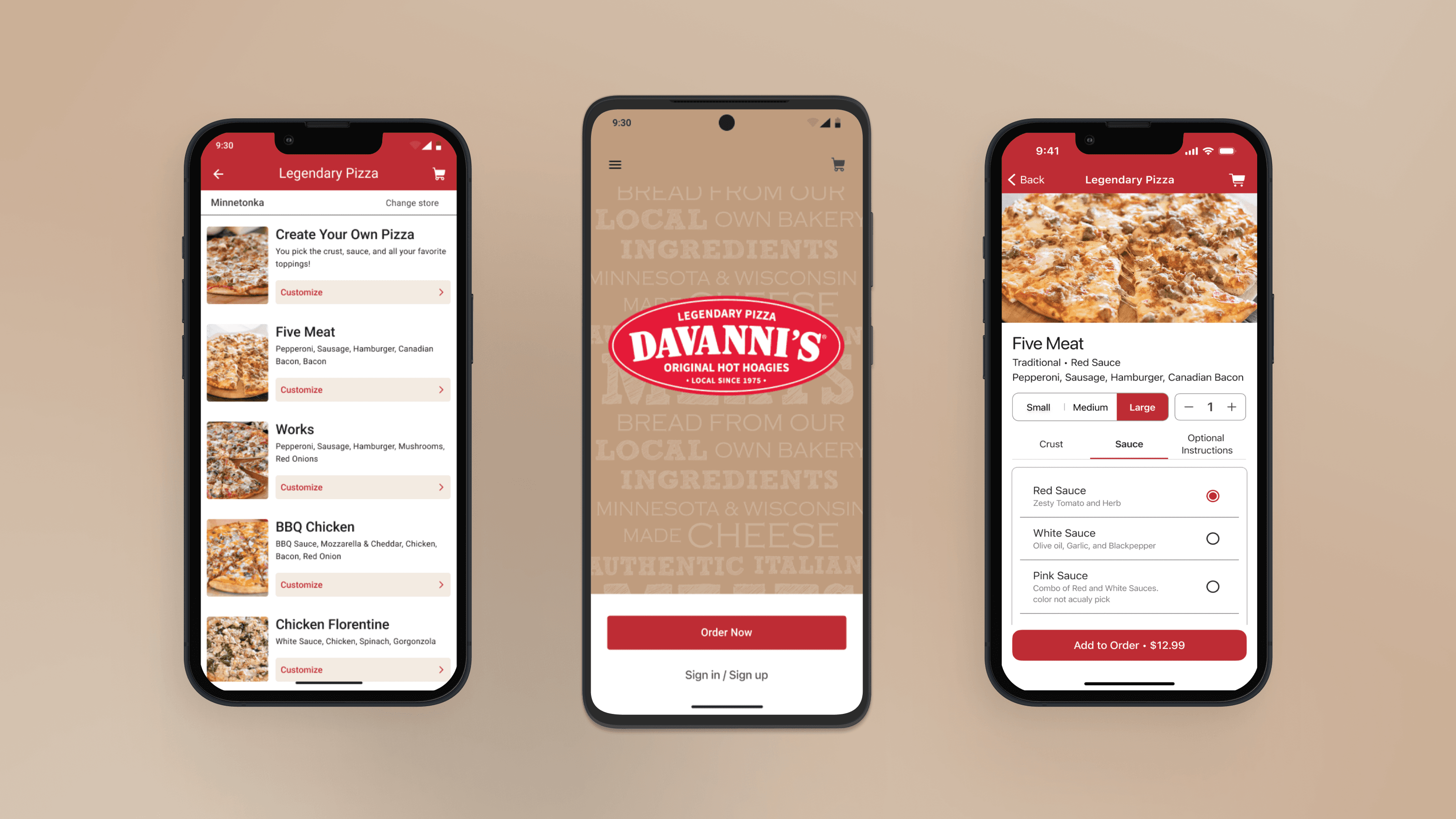
The existing menu had unnecessary dropdowns and lacked ingredient information. To streamline this experience, I restructured the layout, add ingredient information, removed superfluous dropdowns, and established a clear visual hierarchy. This cleaner structured menu should reduces cognitive load, allowing users to find items more quickly and efficiently, thus improving the overall ordering experience.

The existing menu had unnecessary dropdowns and lacked ingredient information. To streamline this experience, I restructured the layout, add ingredient information, removed superfluous dropdowns, and established a clear visual hierarchy. This cleaner structured menu should reduces cognitive load, allowing users to find items more quickly and efficiently, thus improving the overall ordering experience.

The existing menu had unnecessary dropdowns and lacked ingredient information. To streamline this experience, I restructured the layout, add ingredient information, removed superfluous dropdowns, and established a clear visual hierarchy. This cleaner structured menu should reduces cognitive load, allowing users to find items more quickly and efficiently, thus improving the overall ordering experience.

The existing menu had unnecessary dropdowns and lacked ingredient information. To streamline this experience, I restructured the layout, add ingredient information, removed superfluous dropdowns, and established a clear visual hierarchy. This cleaner structured menu should reduces cognitive load, allowing users to find items more quickly and efficiently, thus improving the overall ordering experience.

Old design

New design

Visual Design Elements

To maintain brand consistency, I retained Davanni's established color palette. This ensured a balance between familiarity and improvement in the redesign. By keeping the recognizable brand colors, I hope to build upon the existing visual identity while introducing enhancements to the overall user experience.

Prototype

Screens

Prototype

Screens

To see prototype, open on desktop.

Prototype

Screens

Future Directions

For real-world implementation, key next steps would include:

  1. Usability testing with users

  2. Design iteration based on user feedback

By leveraging platform-specific best practices and focusing on user needs, this redesign could help Davanni's enhance their digital offerings and improve customer satisfaction.
Next Project