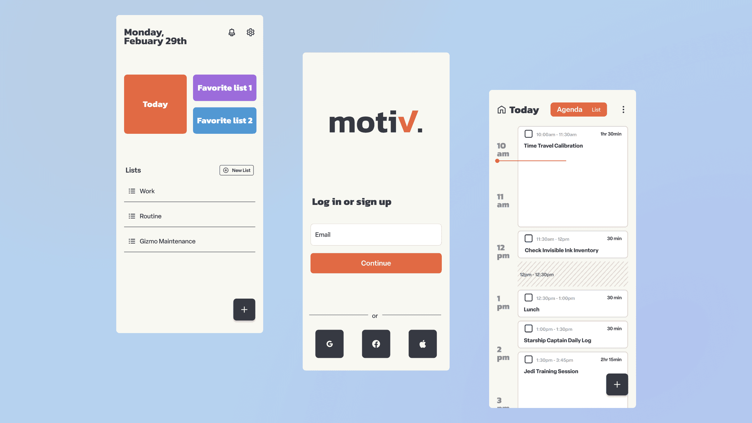
Project Overview and Challenge
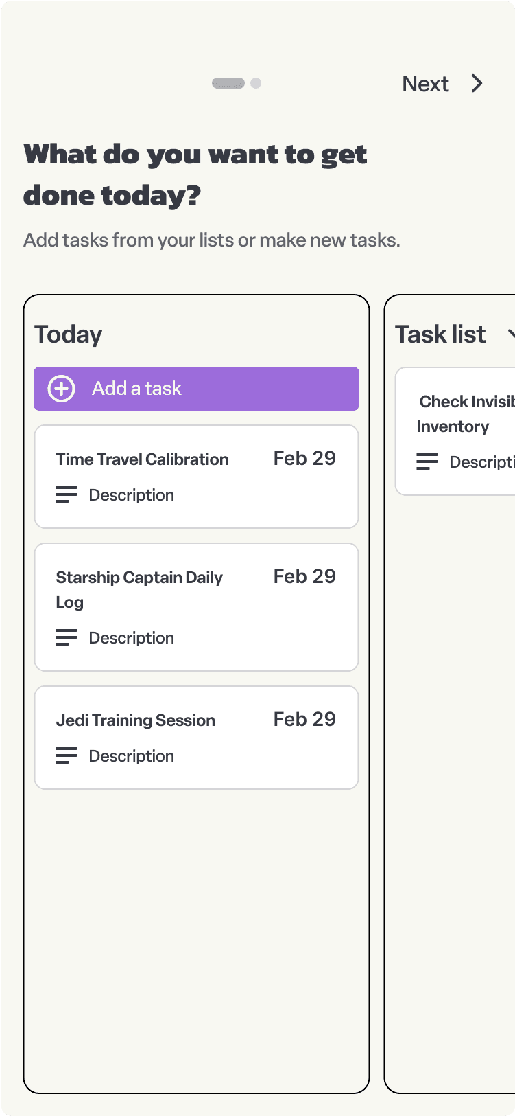
As part of a CareerFoundry bootcamp assignment, I was tasked with designing the user interface for a mobile productivity app. The project goal was to create a unique app concept in the productivity space.
I decided to explore how a productivity app might better serve non-neurotypical users. This presented several challenges:
Creating an interface that could accommodate diverse thinking styles
Balancing functionality with simplicity to avoid overwhelming users
Designing features that align with various organization preferences
Research
My research approach combined competitive analysis with personal insight. I began by examining existing productivity apps like Google Tasks, Todoist, and TickTick. This exploration helped me understand the current landscape of productivity tools and identify potential areas for innovation.
In addition to studying existing apps, I drew from my own struggles with traditional productivity tools to inform the design. I considered what features might better serve my needs and potentially those of others. This approach gave me a starting point for the design process, though I kept in mind that broader user research would be valuable for further development.
Visual Design Elements
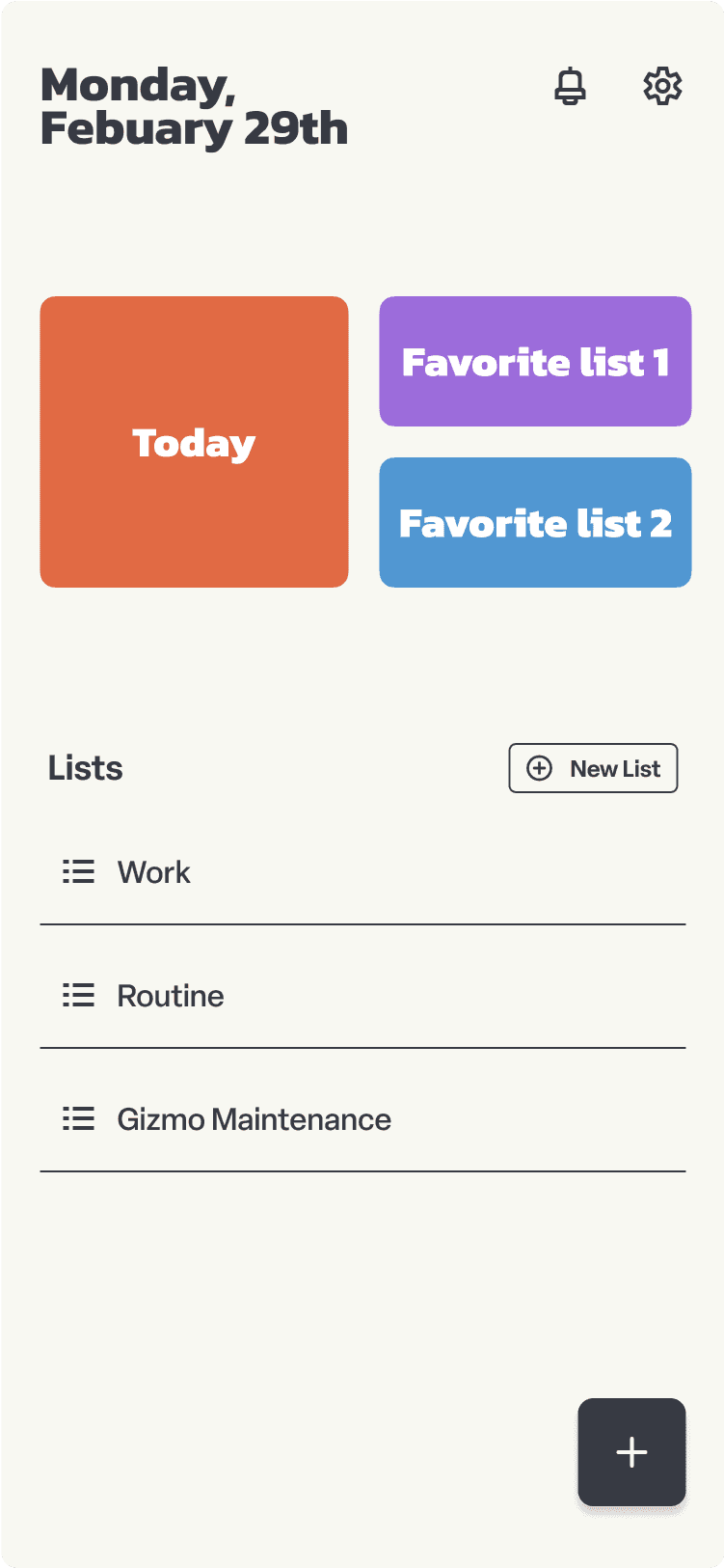
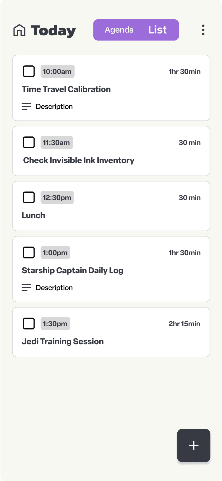
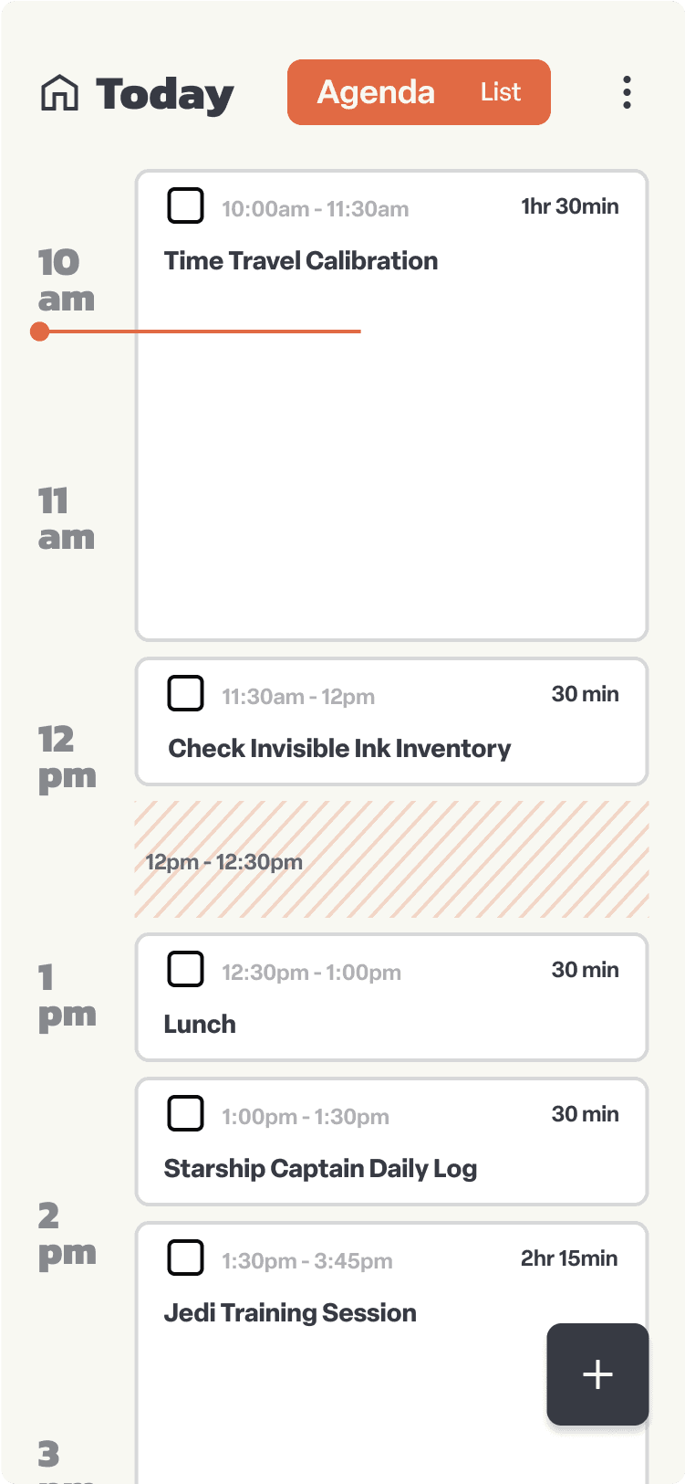
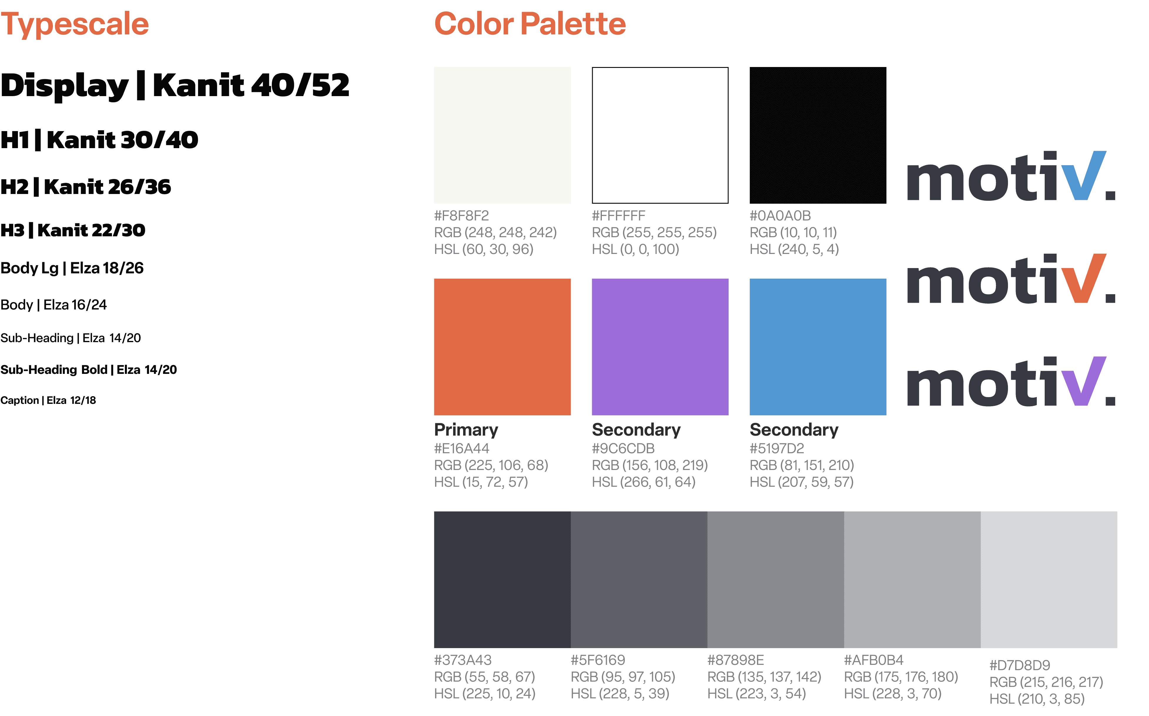
Productivity apps should feel present and empower the information they hold without getting in the way. The design of Motive reflects this philosophy, utilizing calmer colors and friendly typography to create a welcoming and efficient user experience. I used Kanit (headings) for its blend of humanistic and futuristic qualities and Elza (body) for its easier readability. Together, they create a balance of uniqueness and readability.
Next Steps and Future Iterations
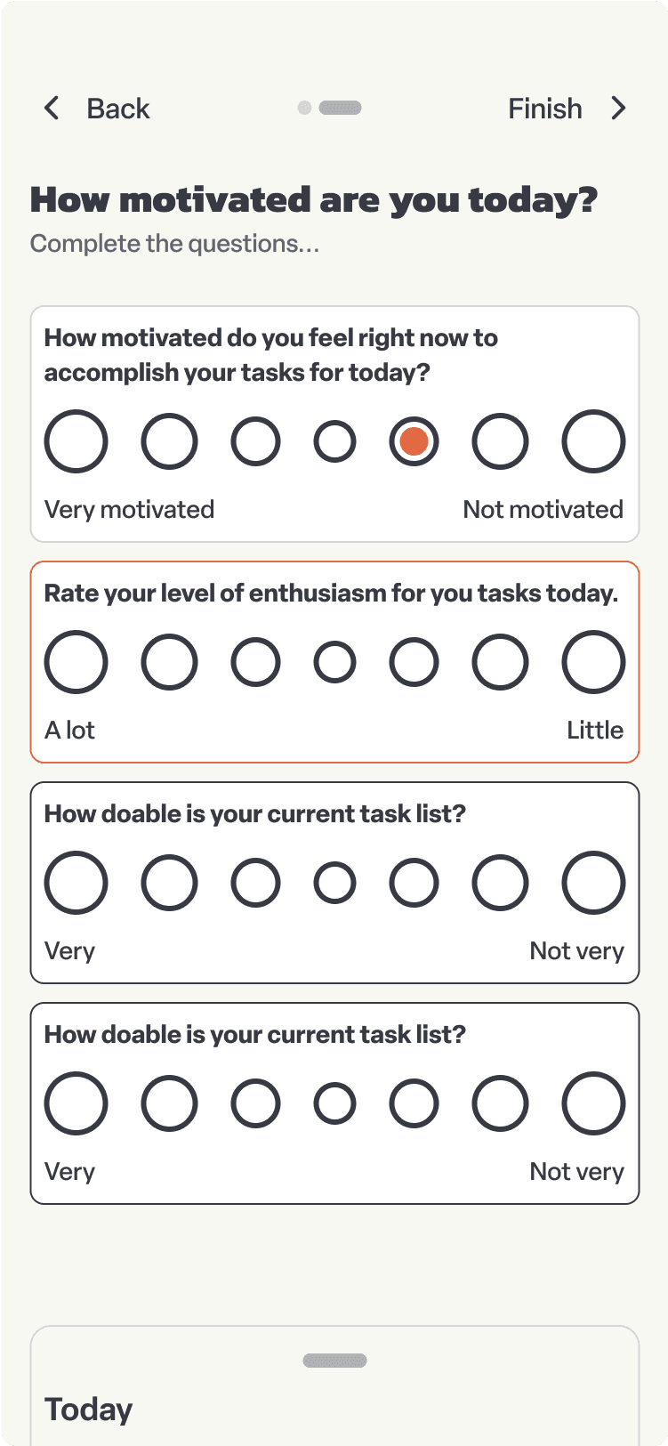
This initial design for Motiv is a strong starting point, but there is certainly room for further refinement and development. The core concept of aligning task planning with the user's motivations and mental state is intriguing, but will require deeper user research and testing to truly optimize the experience.
